The Original Cover Art To Avengers #53
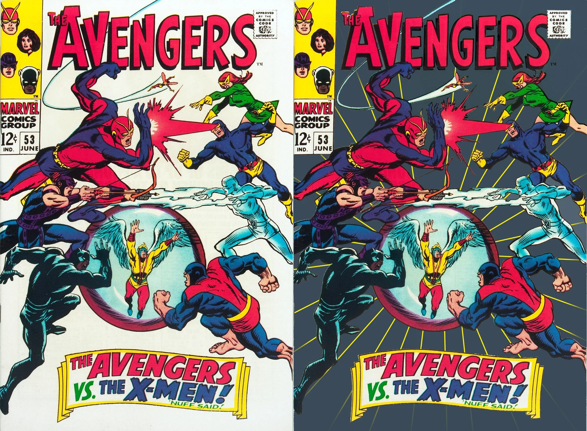
Longtime Marvel fans might find this interesting: If you watched the episode of COLLECTOR'S CALL I was on, I explain that I momentarily debated buying the original cover art to AVENGERS 53 because of the amount of "white out" on it.
After I DID buy it, on closer inspection, I saw WHY there was a lot of white out. (I explained this during the taping, but it didn't make the final edit). If you hold it up to the light, you can see that there were originally lots of black inked lines that were "radiating" from the sphere The Angel's inside.
On a WHITE cover (as we all think of it having), that'd have been visually obnoxious. It seems clear to me that it was originally intended for the background to be a DARK color, and those "rays" would've been "reversed out" in white, yellow, or some lighter (than the background) color.
Stan must've changed his mind (or somebody else's) on that, and when the cover went to WHITE, all those rays hadda be whited out (and are). Just for fun, I roughed in that dark gray and put rays back to show how it was probably originally intended to look. (Which, even had it been dark blue, or green, or purple, would have been a lot like Buscema's OTHER famed "face-off" cover, AVENGERS ANNUAL #2)